Thursday, December 8, 2011

Rubik's Cubes, men's hygiene, and 2012

Praise Jesus the end of the semester is here! I've been busy with quite a few design projects this past month. As posted earlier this week, I just finished and am selling 2012 calendars I designed. I'd appreciate your support in buying one! You can view and purchase the calendars here.
I've also been busy working on a couple design projects for school. These were a couple of the most extensive and also most exciting projects I've done to date, and I'm very happy with how both turned out. All the design projects this semester have pushed the limits of what I can achieve and design with enough research and critical thinking. Really happy for my new art instructor, Jeff Smith, who has a high standard of excellence for us. I think its paying off!
This first set of images is a line of men's bath and body products called CODEX (I've gotten most criticism about the name from women, who immediately think of Kotex- a feminine product! ha. However, my sister made a good point: Its ironic that Kotex is a strictly feminine product, and that CODEX is a strictly masculine product). The target audience is ages 30-50. The idea behind the design of CODEX is that I want there to be a line of products that encourage men to get off the couch and be "real men" Its a product that helps lazy, no-game guys turn it around by offering the essentials you need to make that happen. Its actually meant for different types of men: those who are lacking that "manly" edge, and also those who are already "manly men" but need a product that is up to par with their manly lifestyle. Do you think this communicates the idea well?


The entire product consists of lotion, cologne, shaving cream, hair wax, a t-shirt, and a few other random items for the perfect "manly package" ;)
I also had to make some stationery to go with the style of the products  

In addition to B&B products and stationery, I also had to come up with an ad and promo poster. Pretty clever ad if I do say so myself... :)

Ryan is the face of CODEX

This next project is an album design. Believe it or not, the inspiration for the entire design came from a Rubik's Cube and an old book. We had to take 2 random objects and come up with a title for an album for the band of our choosing. Naturally, I chose my own band, Static Society. Not only did we need to come up with a title, but we also needed a concept, or story, that adhered to the title.
The title I came up with was The Cubist Compendium. The concept behind the title and the design is the idea that life can be simpler than people make it a lot of the time. A Cubist is type of artist that takes an object and breaks it down into its simplest form (for example, a cubist would take the image of a car and break it down into an image consisting of circles and rectangles). Of course, there is a level of the artist's own interpretation in the art as well. Anyways back to the concept: people today make things in their life so complicated and gray, and it really doesn't have to be that way. There can be black and white areas; there can be absolution; everything doesn't have to be unknown. So The Cubist Compendium concept is essentially about how you can know the areas of absolution, and addresses issues of ambiguity in one's life. The simple shapes mixed with the victorian-style people and grungy backdrop represent clarity and simplicity in a meddled, imperfect world.
The design as a whole is a little more metaphoric and abstract than narrative, but I did't feel like the concept called for a strictly narrative approach, because I am addressing more of an idea than an actual story. I'm very happy with how this came out. What do you think?

Album cover

Booklet design 
CD design and back of the CD case

Promotional postcard


Saturday, December 3, 2011

You need calendars. I made some for you.

Whew after working on these for a long time, they are finally up for sale- my series of 2012 calendars! Just in time for Christmas, too. I can see these stuffing many stockings! With 6 different designs, there is probably one for you, so check them out! View my calendars here!
Here's some images of some of the calendars to get your interest growing :)


Friday, October 14, 2011

Workin' Away

Got a few new things in the works that I wanted to update you on:

Graceway baseball T-Shirt:
These are only gonna be for a group from my church that's going to the Dominican Republic (not church-wide), but I am really happy with how they came out! Who knows, maybe they'll get some more use this next season?

2012 Calendars:
I put up a little preview of each of the ones I'm working on on facebook and twitter, but here's a whole image of one of the calendars. some of them are half practical, half cool-looking. This one is more on the cool-looking side, but I think the fact that it's not traditional makes it my favorite of the ones I'm doing. I'll probably be selling them for like $15 each, starting in November sometime, by then I should have a good 5 or 6 options to choose from, but here's one of them to see now:


Fleetfoot Delivery Co.:
Yet another school project. It's a branding project, complete with logo, stationery (business card, envelope, and letterhead) package design, and an accompanying ad:


This version got scrapped, but I actually had most fun making this one. The first thing that came to my mind for this company was a fox, signifying that it has quick service. Plus, I thought I came up with a pretty clever ad, too (second image) ;)


Saturday, September 17, 2011

Higher Digital Sales= Cooler Hard Copies For Me

One of my favorite bands, The Devil Wears Prada, just release their new CD, Dead Throne, this past Tuesday. Needless to say I had to get it. A lot of the time I will buy my music through Amazon or iTunes just for the convenience of it, but when its a band I love or a CD I'm really looking forward to, I'll go buy the hard copy. Part of the reason for this is that it just feels more personal to me; I feel more connected to the music when I have something in my hands that the band made. But the other reason I still buy hard copies is because i LOVE album artwork. I just love how every part coincides with one another (I love it the most when the design on the CD fits with the rest of the design). Anyway, so I go get this new TDWP CD, and I was really impressed with the packaging. Like, really impressed. So much so that when I got done looking through the design of the packaging, I closed it up, forgetting that what I opened it for was for the actual CD! I would say mission accomplished for this design. That got me thinking about other CD packaging designs that have impressed me. Here's some examples of a few that I've really loved that have just come out this past year:

The Devil Wears Prada- Dead Throne


A Classic tri-fold. Nothing new yet....
This is where it gets unique: These panels all flip up!
You can see why I forgot to even grab the CD...but I love that!
Another unique way to incorporate the "CD sleeve"

Underoath- Disambiguation

This one is more about the CD sleeve, but the casing looks cool too.


This tri-fold case is a trip...
The awesome thing about this sleeve is that it uses regular paper AND vellum! The result is freaking awesome-looking. 
All of the artwork for this album was good.

I wish I could capture the level of complexity and thought that went into the design of each of these pages. You really do have to see it in person to get the full effect. You can tell the placement of every word and every design element was carefully thought out, even though it has a "random" look to it.

A Day To Remember- What Separates Me From You

This casing is cool in that with each fold, it tells a part of a story. Plus the fact that it opens up to a sort of cross shape is something I've never seen before in this type of media. Maybe its been done before? Idk, I don't care. It really works here.


This part is pretty clever. This is the top view of a street, and in the middle there, the band is down in the sewer. What makes it great is the fact that the CD deign looks like the lid to the sewer- how cool!

Do you know of any other cool examples of CD cases? Share them with me!

T-Rave pt.2

I've done a bit of work for my friend Travis Geary (aka T-Rave) in the past, mostly for personal projects that he's involved in or starts. The more I design something that involves T-Rave, though, the more I think its more fun than work. T-Rave has done a good job of kinda making himself a product, so I feel like its pretty easy to design things that have to do with him. I'm a big fan of "Aha's" in design, and just for clever little doodads in general, and I feel like I can naturally create things like that in T-Rave's case.
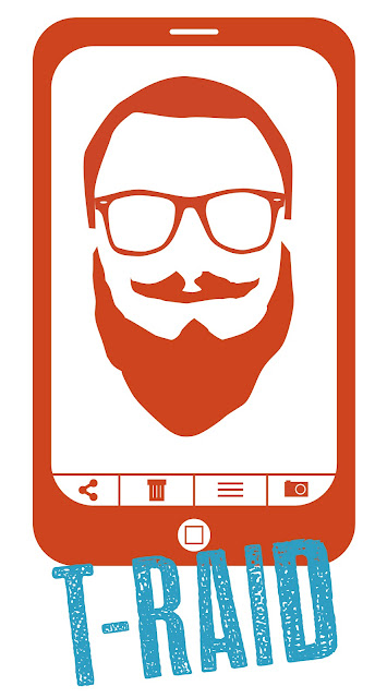
Anyways, recently T-Rave has been the culprit of many self-taken photo bombs, where he will apprehend an unattended phone and/or camera and snap a picture of himself. He will then post this photo on Facebook, twitter, etc. (with rather nice things to say about himself, I might add). This gave me a small spark of inspiration to design something quirky for T-Rave, to support even his wildest, least-serious endeavors:


Wednesday, September 14, 2011

Straits Wedding invitations!

Whew these invites took a while, but I'm pretty pleased with how they turned out. My sister-in-law is somewhat of a designer herself, so she's proved to be my toughest client to date since she had as many ideas in mind as i did! In the end, a pretty good wedding invite came out of it, though. Take a look-- Can't wait for October 21!


Congrats, Ryan and Jordan!
BTW: Ryan and Jordan just got their engagement pictures posted online by Lark Photography.

Tuesday, August 30, 2011

A long time coming

Freakin excited right now, because my band's (Static Society) debut album "Beholders" is up on iTunes today! We are so excited about this, it really has been a long time coming. We've been a band for about 3 years, and things just started coming in to place where we could record our album, and it came out great! I think the best part about it is that it was all (for the most part) created by the band. Our keys player, Morgan Cooper, did the recording and mixing and what not. We got some friends (JT Daniels and Dominic Petrucci) to help with the album cover/casing), but then we assembled, packaged, burned, and labelled them ourselves. Tedious, time-consuming work to say the least, but we feel like the end product was worth the effort we put in. And hopefully it shows to all who hear our music. Now we're just excited to get back to playing more shows, spread our music, and grow our fan base. Help support by getting our CD on iTunes or cdbaby.com today!!


Monday, June 20, 2011

What's been going on this summer?

Not doing too much really. Watching many movies. Sleeping.... well not really that much more often. Trying to work when i can. BUT just to fill you in with a bit more detail, i'll bullet-point the basics.

  • Just got my first smartphone. It rules. Am i one of those people that say  i now can't live my life without it? Not yet. Although I know it will make me more available to do some broader networking, so thats a plus. Also having the fat booth app is the best thing ever.
  • My wife just got her first full time job! She graduated in May, so we're happy that she was able to land a job fairly soon. I'm ok with having a sugar momma for a little while, but i'd like to get my own career going sooner than later too!
  • In light of my wife's aforementioned job, we may be moving into the city! Not fully decided yet, but its where we initially wanted to move when we got married and it didn't really work out, plus an apartment we really like is available to move into.
  • Gonna be a counsellor at my church's high school camp in a couple weeks. I got to design the logo for the theme this year:
You might be wondering if i've done anything in the design realm this summer. The answer is yes. Not too much, but enough to keep me occupied. One project was of that mentioned above. The most recent thing i designed were a couple father's day cards for my dad and father-in-law:

(My dad's is the bottom one; my father-in-law's [Dan's] is on top)

My big project this summer has been my sister-in-law's wedding invitations. How exciting! This has been a tough but very fun project. I'm still working on the formal invitation so i can't show you much, but the save the dates have already been sent out so i'll show you that to give you a little preview of what the feel of the formal ones should look like:

oh yes... it's coming...
So that's about it for now. Hope your summer is going good!
BTW i'm on twitter now! follow me! @lileseric

Thursday, June 2, 2011

I guess its a poem...

I was standing in church Sunday, listening to the music, when my friend began to sing. She has such a beautiful voice its almost unfair to the rest of the world. Well anyways, as i considered this, i also thought about the fact that she is also a Spanish teacher. It was amazing to consider the fact that God has gifted her mouth in so many ways to bless other people. I started to wonder, "what has God gifted me with?" To be honest, i'm not great at much of anything; I'm good at a lot of things, but not great. Fortunately it didn't take me long to figure it out- God has given me gifted hands. I play drums, and i am a developing graphic designer. Some may argue whether or not graphic design is a gift of the hands, but i definitely think it is (its a big factor, at least). Sadly though, i pop my fingers all the time, will probably have carpal tunnel within the next decade, and have quite recently developed a recurring twitch in my thumb. So i'm not sure how long these hands will last, but i'm hoping things will pan out. In light of my gifted hands revelation, i began developing a collection of thoughts on my hands, which has turned into a poem of sorts. I'm no poet, so i don't know why i wanted to make this a poem, but i did, so here you go.

These Hands

These hands aren't much, are they?
They are big and long and boney.
They are calloused.
They ache.
They twitch.
But they can palm a basketball....I guess that's cool.

These hands bow to the right side of my brain.
These hands create.
They drum.
They design.

These hands wish they could do tons of other things.
Like play the piano.
Or the guitar.
Or draw better.
Or do that pen-flip thing.
Maybe one day...

These hands love.
They hug.
They shake hands.
They high five.
They pat backs.

But these same hands sin.

They lust.
They hate.
They steal.
They envy.

These hands get lazy.
They love the remote control.
They waste time.

In the end, I think God still loves them, though.

Now they work.
Now they praise.
Now they love.

Monday, May 9, 2011

Fine Art

Just a few pieces I did for drawing class this last semester that I didn't think came out too bad.

This was more comical to me, but it was actually a good nose study. There's some friends and family noses as well as some notable celebrity noses (Michael Jackson, Jay-Z, Adrian Brody, etc..)

I just like how this one came out in the end.

The goal of this piece was to take and "old master" sketch (in this case, Leonardo's "Condottiere") and make an abstract collage. I sort of went outside those boundaries a little, because there is a theme to the piece- war. I didn't try to communicate any personal stance on war, whether I agree or don't agree with it or whatever. I just wanted to show the characteristics of war. What is war? How does it make people feel? There is no one-sided opinion, just the facts of war. War is messy, its violent, its dark, and sadly seems to be the only way that anyone can resolve an issue over the past 5000+ years. I used paper cutouts, acrylic, charcoal, coffee, pen, and a wood burner to create the final image.

Color pastels- I like how the colors came out for this one. Just so vibrant!